Color theory and coloristics are based on the Itten color wheel. In this article, we will explain: what a color wheel is, which colors are primary, secondary, and tertiary, and we will look at the principles of color combining and how to use them in your work.
The main tool when working with color is the Itten color wheel. In this article, we will talk about what the Itten color wheel is, which colors are primary, secondary, and tertiary, examine the principles of color combining, and how to use them in your work.
What is the Itten color wheel?
The principles of color combining are used not only in the work of many beauty professions but also form the basis of product manufacturing (hair or brow dyes, decorative cosmetics, nail design materials, etc.)
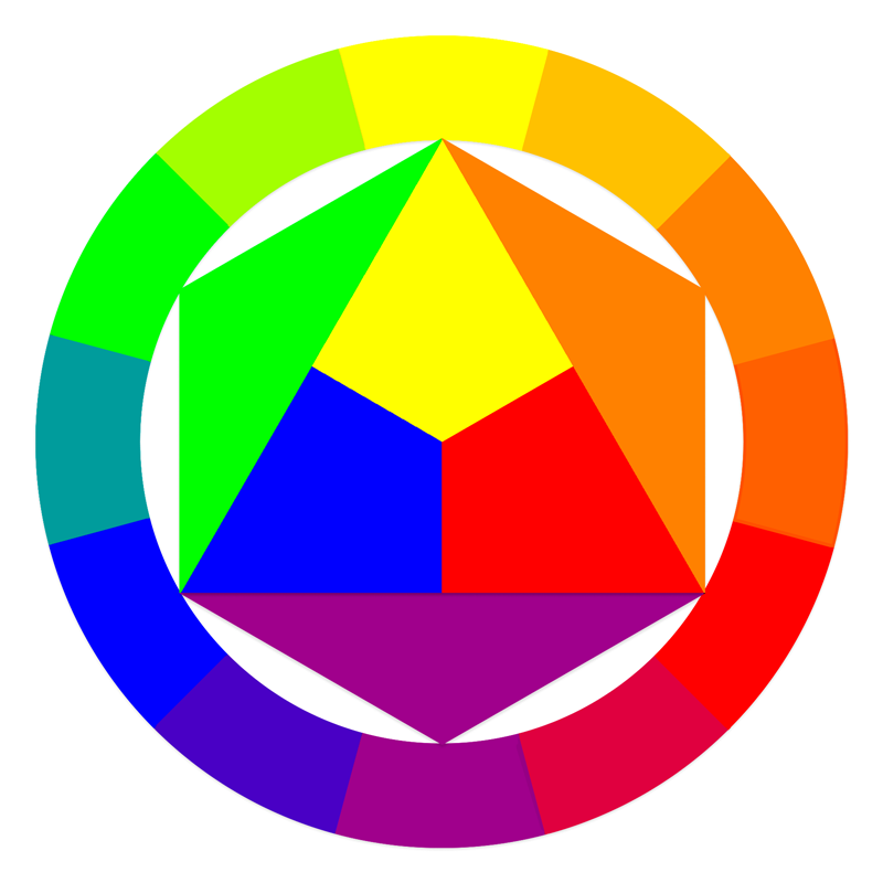
The Itten color wheel is a visual scheme of color formation and interaction, based on 12 colors (primary, secondary, and tertiary colors).
The Itten color wheel is the most well-known and simple scheme.
A brief excursion into history:
Johannes Itten was a Swiss painter and art theorist, author of the book "The Art of Color" (by the way, highly recommended reading). Itten was not the first to work on systematizing color, its combinations, and perception. But it is the Itten color wheel that is the most simple and universal scheme for color formation and combination.
How is the Itten color wheel structured?
The Itten color wheel is presented in the form of a circular diagram based on 12 colors, which are distributed to visualize their interrelation. These colors are divided into primary (red, yellow, blue), secondary (orange, green, purple), and tertiary (yellow-orange, red-orange, red-violet, blue-violet, blue-green, and yellow-green). Each color in the Itten wheel is additionally divided into warm and cool shades.
Primary colors in the Itten wheel
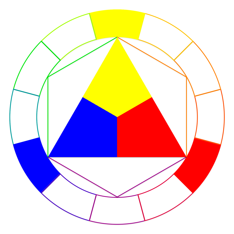
At the core of the Itten color wheel lie three colors, which are called primary:
- red;
- yellow;
- blue.
These are base colors located at an equal distance from each other on the circle. These colors cannot be obtained by mixing other shades; they serve as the basis for all other colors.
Essentially, all the shades we see are the result of combining primary colors in different proportions.
Secondary and tertiary colors
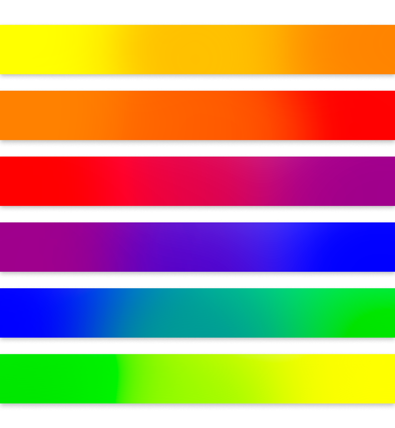
Let's recall school art lessons. Surely, everyone remembers the lesson where mixing two shades resulted in a third. The same principle applies to forming secondary and tertiary colors in the color wheel.
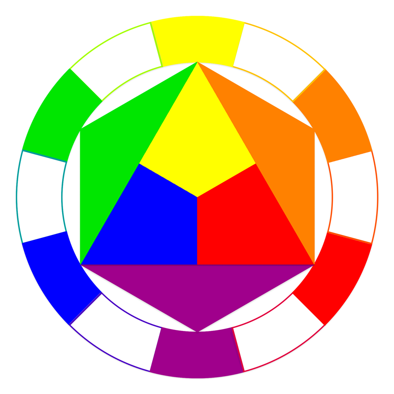
Secondary colors are formed by mixing two primary colors - red, yellow, and blue. In the color wheel, these colors are located in the middle between the primary ones.
Secondary colors include:
- orange (mixture of red and yellow);
- green (mixture of yellow and blue);
- purple (mixture of blue and red).
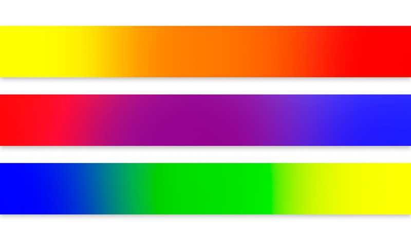
Tertiary colors are formed by mixing one primary and one secondary color. In the color wheel, they occupy an intermediate position between the primary and secondary colors.
Tertiary colors include:
- yellow-orange;
- red-orange;
- red-violet;
- blue-violet;
- blue-green;
- yellow-green.
White and black color in color theory
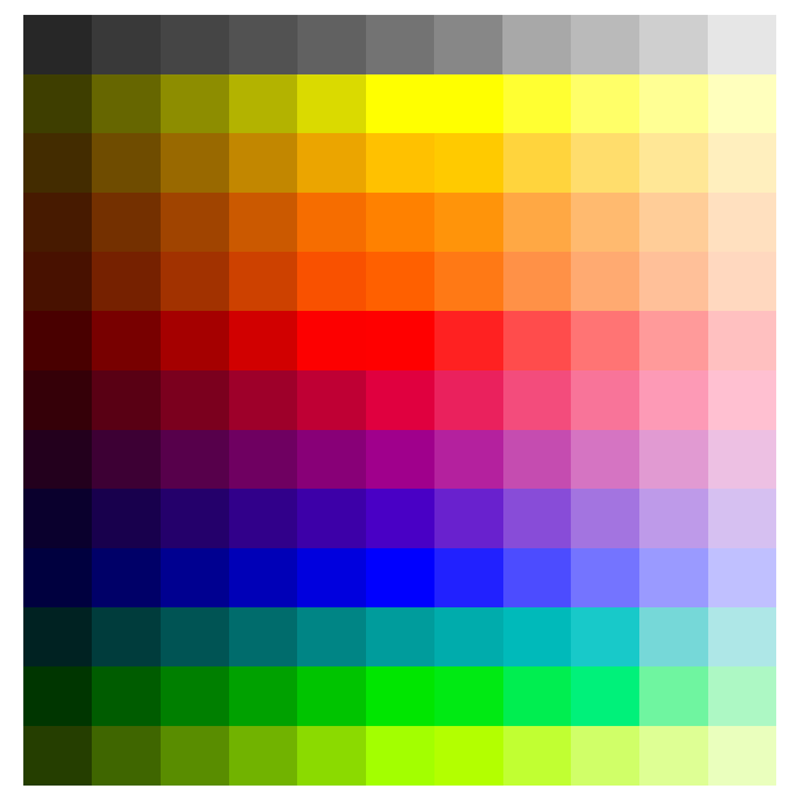
White and black colors stand absolutely apart in the color scheme. They are not represented on the classic Itten color wheel because they are not spectral.
Recalling school physics lessons: white is based on the entire light spectrum, meaning white is a combination of all colors. Black, on the contrary, is the complete absence of light and color.
However, in color theory, white and black are the most important elements in creating shades and tones. White is used for lightening, creating lighter shades of primary and secondary colors. Black darkens colors, giving them depth and saturation, which makes the shades more expressive.
Warm and cool shades according to the color wheel
Additionally, colors in the color wheel are divided into warm and cool, which determines their perception.
Warm colors include red, orange, yellow, and all shades formed by their mixture. These shades look brighter and, from the perspective of human perception, seem to "approach" and create a feeling of warmth and comfort.
Cool shades include blue, green, purple, and all shades formed by their mixture. Visually, cool shades seem to "recede" and are associated with a feeling of coolness.
The separation into warm and cool shades in the color wheel runs visually approximately along the line connecting the yellow-green and red-violet colors.
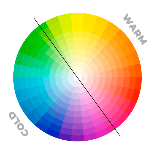
By the way, it is worth noting that yellow-green and red-violet can be perceived as both warm and cool shades depending on the prevalence of base shades in them.
Color combining schemes based on the Itten color wheel
The principles of color combination and harmony are built based on the Itten color wheel.
There are three main principles/schemes for color combining: complementary colors, analogous, and triad colors.
Complementary - a combination based on two colors that are opposite each other on the color wheel. Such colors create a strong contrast and mutually enhance each other, making the combination bright and dynamic.
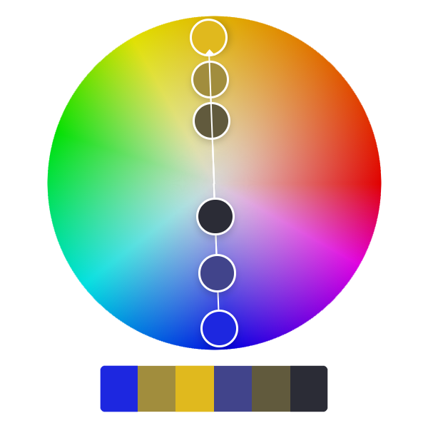
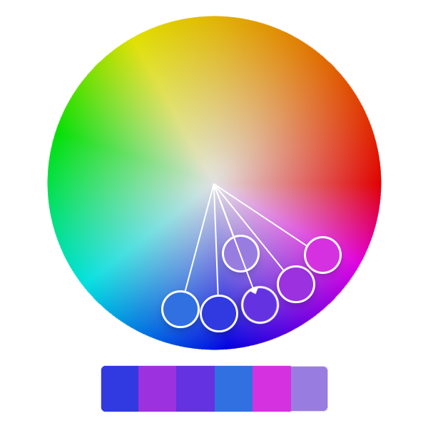
Analogous - colors are next to each other on the color wheel. Such colors have one common main color component and create a harmonious combination. Analogous color schemes are often used to create a calm and balanced effect.
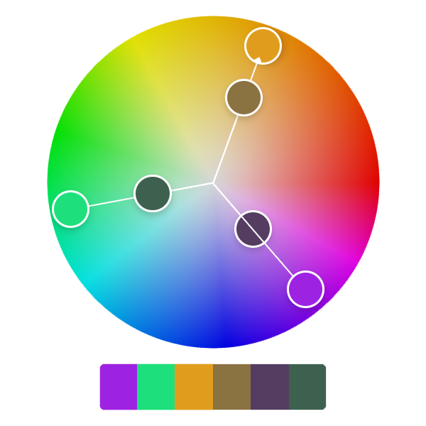
Triangular (triad) - a combination based on three colors evenly distributed around the color wheel. This scheme creates a bright and balanced contrast, often used to create a dynamic and lively effect.
Additional combinations include: split-complementary, compound (double complementary), square, tonal, and monochromatic.
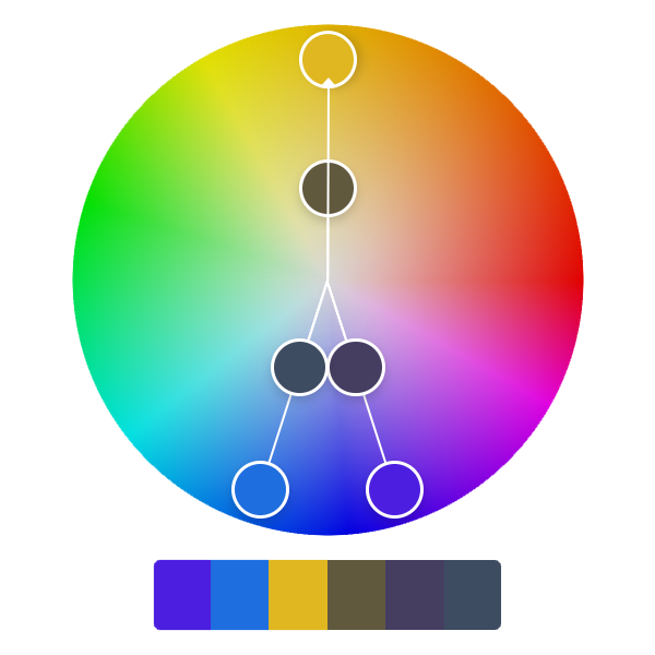
Split-complementary - a color scheme including one main color and two colors located next to its complementary color. This scheme provides high contrast and harmony, but with less tension than a complementary combination.
Compound (double complementary) - a color scheme including two pairs of complementary colors. This scheme uses four colors that form a rectangle or square on the color wheel.
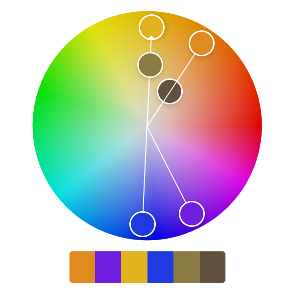
Square - a color scheme based on four colors evenly distributed around the circle, forming a square. This scheme includes two pairs of complementary colors, creating a rich and balanced color contrast.
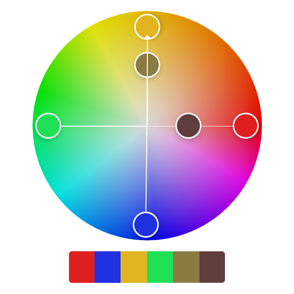
Tonal (Value) - usage of different colors, tones, and saturations of one color. Creates an elegant and professional effect where the focus is on form and content, not on color contrasts.
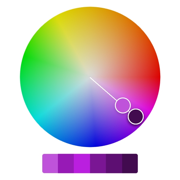
Monochromatic - combination of different shades, tones, and saturations of one color. In such a color scheme, one main color is used, which varies in brightness (from light to dark) and saturation (from saturated to less saturated).
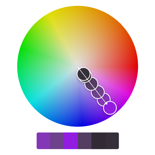
You can find a suitable color combination scheme using the Color.adobe.com website
Using the color wheel in the beauty sphere
The color wheel is an important tool in the beauty industry, both directly in the work of masters and in the development and production of cosmetic products.
Here, it is appropriate to recall the concept of seasonal appearance color types: winter, spring, summer, autumn. This is where beauty masters most often work with the color wheel, color combinations, and their temperature. Color types are actively used by makeup artists, hair colorists, and brow artists to correctly determine the client's appearance and suitable shades that will highlight the client's strengths.
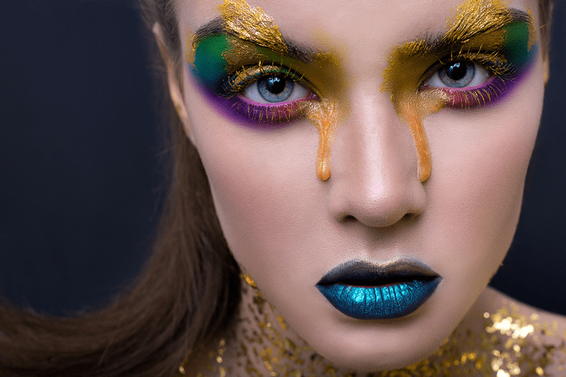
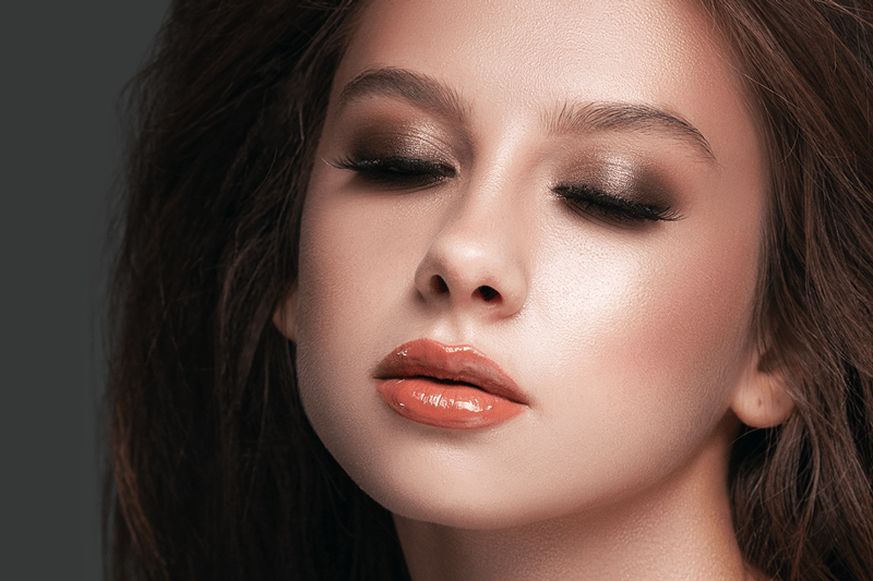
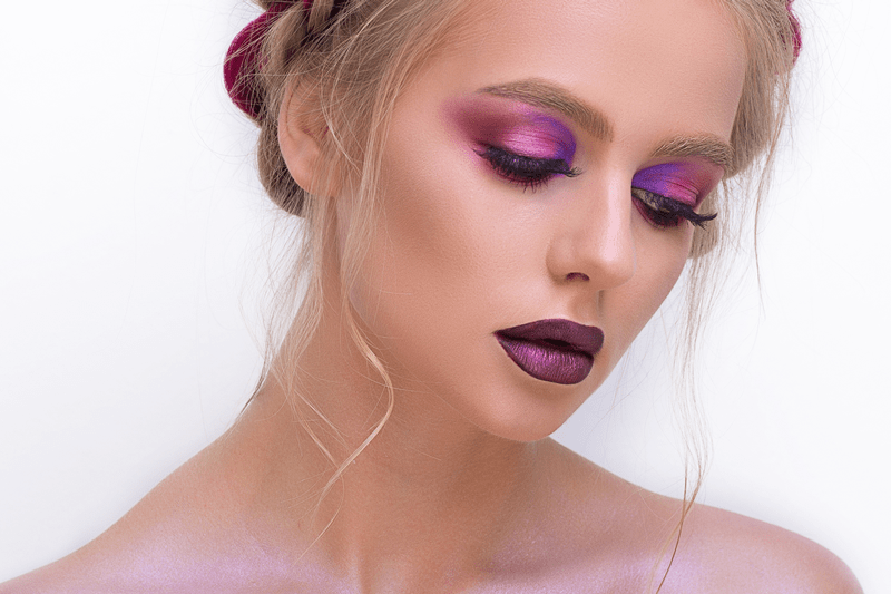
For example, to create makeup, you can use complementary colors (located opposite each other on the circle) for contrast, or analogous colors (located next to each other) for a softer and more natural look.
Or - selecting a shade based on skin tone color temperature (warm shades look better on warm skin types, and cool ones on cool).
Makeup with complementary colors
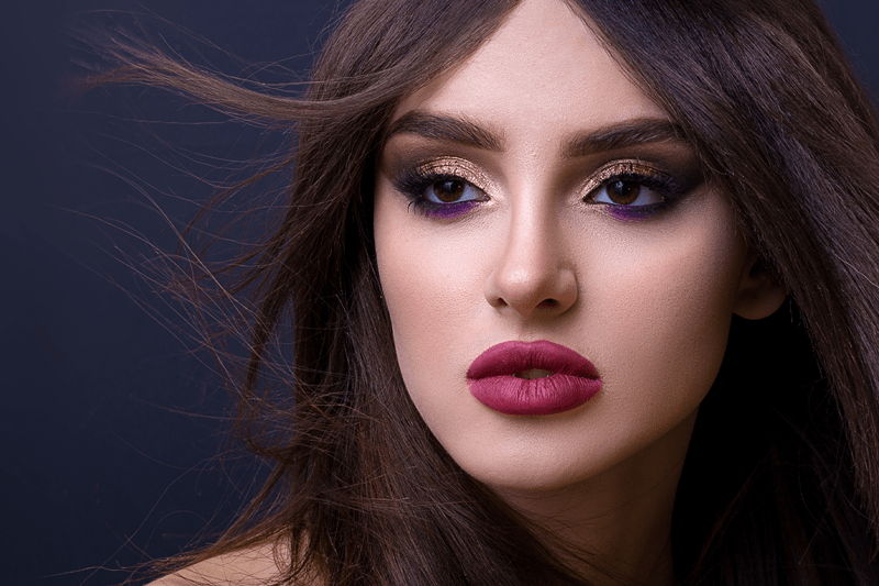
Makeup using analogous colors
Often in their work, beauty masters use color correction. Here it is appropriate to recall the term "neutralization," which is based on the principle of color complementarity:
- Neutralization of yellowness if you want to get neutral or ashy shades. The warm yellow color is neutralized by cool purple.
- In makeup, with the help of a green corrector, you can neutralize skin redness, and with a peach one - blue under-eye circles.
- When working with old permanent makeup, masters often encounter blue, gray, or green undertones, for the neutralization of which corresponding correctors are used.
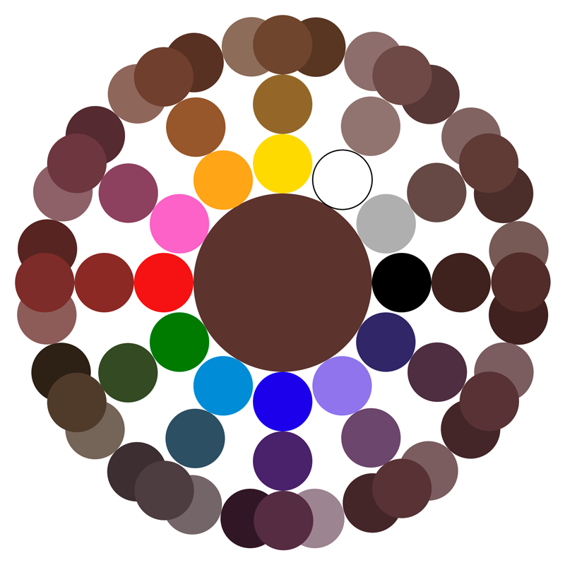
The principle of color combination and formation underlies the creation of any dyes, including eyebrow dyes.
Classic brown color is created by combining green and red, a huge palette of brown shades - by combining orange with black or blue, yellow and purple.
Knowing the basics of color combination will also help during photo and video shoots to create a juicy and saturated picture, and to choose looks and accessories.
The Itten color wheel and color combination schemes represent an indispensable tool in the world of the beauty industry, providing makeup artists and stylists with important knowledge for creating harmonious and attractive looks. By mastering the basic principles of color theory, you can more accurately select shades, emphasize the strengths of appearance, and hide flaws, while creating a unique style for each client.
The color wheel not only enriches the creative process but also opens up new possibilities for experiments, allowing you to find perfect combinations!